What is the Sigmund Collection?

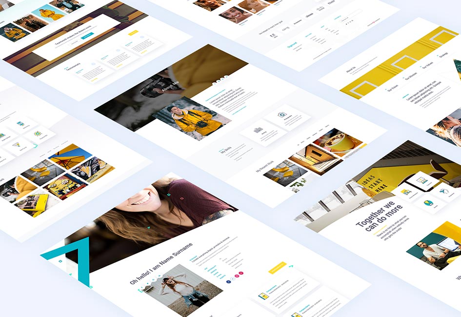
The Sigmund Collection is composed of a range of beautiful page layouts and modules. It’s been designed to assist web designers to build a range of websites whether for professionals, side hustle businesses or for services such as electricians or architects. Truly multi-purpose designs.
Web designers who have some knowledge of the Divi Theme and Visual Builder will have no problem taking the Sigmund layouts and modules and quickly building new websites for their clients. Easily replace text and images. Change the colour scheme. Perhaps even swap around modules. Immediately it’s a totally different website which can be used for any business, hobby or interest.
Web Development is so much Quicker
The combo of Divi Theme and Divi Den Pro’s products cuts website design and development time in half if not more. And it’s without the risk of compromising style and quality. It does of course depend on how much experience the web designer has in working with a page builder and possibly with Photoshop. All Divi Den Pro’s products come with PSDs. The more experience the quicker the build.
Divi Den Pro’s designer, Kyra, built a website for a friend. It’s for a B&B in Tuscany and she used Jamie. It took half a day for a five page site. Client had no changes and loved it. Once this hospitality focused site is live, it’s planned for next week, we will write a full case study about it. This way it will be easy to follow the entire process.
Of course Kyra has worked with her designs and knows her way around the layouts. Still, even for a less experienced designer it would not take more than two days, if that, to develop a five page brochure style site. The work is so much easier and quicker.
It’s also easier to impress clients. There are so many page layout and module options it’s really quick to present a new look and feel without spending days on redesigning a project. As the designer has the choice amongst pre-made modules the client will be able to immediately see how the website works never mind appreciate the micro interactions such as the the hover animations.
It is much easier for a client to view this process than present them with a jpeg that does not show the responsive views. The transition between jpegs and final built pages is always quite difficult for a non web designer to understand. It requires some imagination and a fair amount of experience as to how a site will look on a smartphone.
What does The Sigmund Collection have?
Sigmund has:
Page Layouts: – 18 pages
- 2 Home pages
- 16 Inside pages: About, Services, Team, Blog, Pricing, Our office, Contact pages
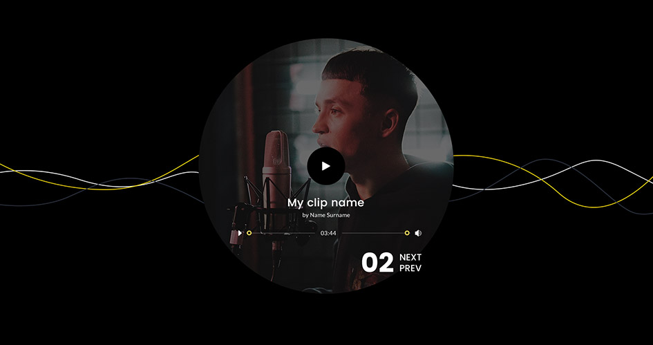
Modules – 49 units
- 10 Divi Blurbs, 10 Divi Headers, 5 Divi Contact Forms
- 5 Divi Person, 3 Divi Call to Action, 1 Divi Blog
- 2 Divi Portfolio, 1 Divi Accordion, 3 Divi Content
- 1 Divi Tabs, 2 Divi Pricing Tables, 2 Divi Sliders
- 4 Divi Testimonials
Some Special Features – Micro Interactions
One of the current trends in web design are micro interactions. These are small movements generally created for mouse over action. The reason for micro interactions is to give the page an interesting additional dimension. By allowing your users to create their own interactions with a mouse over movement means there is some playfulness on the page and an attention grabbing element.
Micro interactions have found their place on websites as they tend to have a tiny footprint. Rather than the large Flash files during the days of more seriously elaborate 2D animation sequences micro interactions are tiny bits of code which do not affect the download speed of the page. Remember the days of the hourglass animation. Glued to it waiting for the page to load. These micro interactions do not require the same levels of patience.
Have a look at the super on-mouse-over animations on the various modules and on the page layouts. Some of the images have fun special effects on rollover, buttons change colours and Divi Blurbs flip over to reveal further information. Text moves out of form fields to make way for typing own info into them and more.
Enjoy using the fun icons that have been designed for use as is or replace with own choices. Make use of the divi testimonial modules, divi person module, and see the many micro interactions that don’t detract from the content on a page but add interest to the page with small bits of interactivity.
The Sigmund Collection
We love this product and just know that the Divi Den Pro members will too. Sigmund has two awesome home page Divi Page Layouts and a range of inner pages that will let you build any client website without any hassles.
The many, 49 in total, Divi Modules will allow designers to be more flexible and swap out modules to suit their and their client’s preference. It’s truly easy to customise a page and stamp one’s own style on it.
For the Designers
Use any of the Sigmund Collection units for any project you might work on. The placeholder content is purely there to demo what can be done. Using your own content will make any website you build with the Sigmund Collection look totally different.
As much as some of the layouts have a vague or sometimes specific theme do not let this discourage you from using Sigmund for whatever purpose you need. Your content will make it into whatever industry, service or product you need it for.
Customising The Sigmund Collection
Divi Den Pro’s Collections are fully customisable. You are able to change the copy. Use a favourite font to fit in with your design, change the colours and of course any icons we have used and replace the images.
Please note that although we make every effort to use copyright free images, we do recommend you find your own ones just to make sure that you do not infringe on someone’s copyright. It can be very expensive. Getty Images in particular will go after you.
All products are Responsive.


