Table Of Contents
Creating the section and adding the Divi Blurbs module
Add a standard section, and choose 1/3 + 1/3 + 1/3 structure.
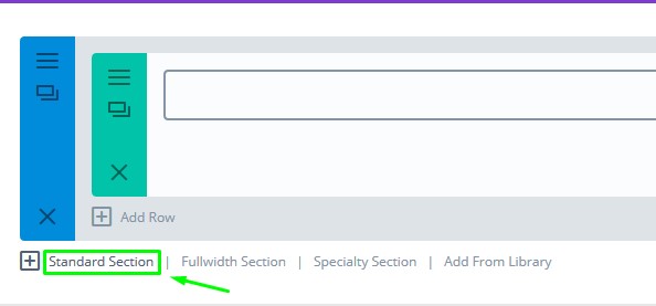
Standard Section
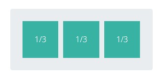
Columns
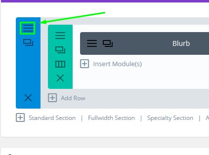
In any of the three columns, add a Blurbs module. For now, let’s add only one, and once we’re done with designing it, you can clone that module to the other two columns.
Add a specific ID and class for this section. Click the section settings icon:
Section Settings
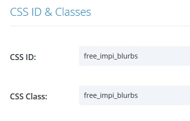
Select Advanced tab, and inside the ID and the Class input fields, type this: free_impi_blurbs
ID and Class
We also want to edit couple of the row settings. Click the row setting icon:
Row Settings
Select Design tab.
- Set Use Custom Width to – YES and make it 11170px
- Set Use Custom Gutter width to – YES and make it 2
Click Save & Exit.
Customising the Divi Blurbs module
Content tab
Let’s first add some content to it.
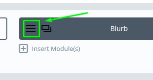
To do so, click the Divi Blurb module settings:
Module settings
Add a title and content:
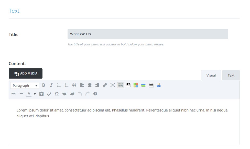
Title and Content
Also set the option Use Icon to – Yes and add an icon. This is the one I’m going to use in this example:
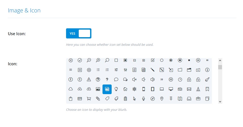
Divi Icons
Design tab
Let’s make our blurb look awesome. Using the Design tab, we want to edit the look of the module, so let’s follow these steps:
- For the icon colour, set #353535.
- Set the Use Icon font size to YES – make it 60px
- Text orientation – set to center
- Title font: PlayFair Display, Bold, 30px, white, centered
- Body font: Lato, Regular, 16px, white, centered
- Also, scroll down to Sizing section and add top padding: 94px, bottom padding 5px, and 43px of padding to each side of the module.
Advanced Tab
Inside the Before box, add this CSS:
content: "Say Hello";

display: block;

font-family: 'Playfair Display',Georgia,"Times New Roman",serif;

font-weight: 700;

font-size: 30px;

line-height: 120%;

position: absolute;

top: 50%;

left: 0;

transform: translate(0,-50%);

width: 100%;

text-align: center;

opacity: 0;

transition: 0.3s;
Inside the Main element box, paste this:
background-color: #353535;
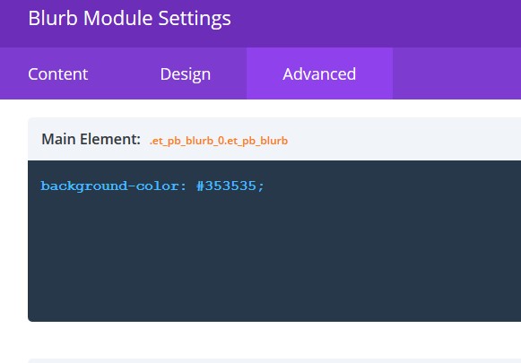
Background Colour
Click Save & Exit.
Adding the custom CSS
To add a great Divi Hover effect to this blurb, we will have to use a bit of CSS.
Copy this CSS code:
/*Fee Impi Blurb*/

.free_impi_blurbs .et_pb_blurb {

cursor: pointer;

overflow: hidden;

position: relative;

}
.free_impi_blurbs .et_pb_blurb .et_pb_blurb_content {

padding-top: 63px;

position: static;

}
.free_impi_blurbs .et_pb_blurb .et_pb_main_blurb_image {

position: absolute;

left: 0;

right: 0;

top: 72px;

}
.free_impi_blurbs .et_pb_blurb {

transition: all 0.3s;

}
.free_impi_blurbs .et_pb_blurb .et_pb_main_blurb_image,

.free_impi_blurbs .et_pb_blurb .et_pb_blurb_content .et_pb_blurb_container {

transition: 0.3s;

transition-delay: 0.3s;

}
.free_impi_blurbs .et_pb_blurb .et_pb_blurb_content .et_pb_blurb_container h4,

.free_impi_blurbs .et_pb_blurb .et_pb_blurb_content .et_pb_blurb_container .et_pb_blurb_description {

transition: opacity 1s;

transition-delay: 0.4s;

opacity: 1;

}
.free_impi_blurbs .et_pb_blurb:hover .et_pb_blurb_content .et_pb_blurb_container h4,

.free_impi_blurbs .et_pb_blurb:hover .et_pb_blurb_content .et_pb_blurb_container .et_pb_blurb_description {

transition: 0.3s;

transition-delay: 0s;

opacity: 0;

}
/*Hover*/

.free_impi_blurbs .et_pb_blurb:hover .et_pb_main_blurb_image {

-webkit-backface-visibility: hidden;

transform: translate(0%, -50%) scale(3);

top: 50%;

opacity: 0.1;

transition-delay: 0s;

}
.free_impi_blurbs .et_pb_blurb:hover:before {

opacity: 1;

transition-delay: 0.3s;

}
.free_impi_blurbs .et_pb_blurb:hover .et_pb_blurb_content .et_pb_blurb_container {

transition-delay: 0s;

opacity: 0;

transform: translate(0, 120%);

}
/*Responsive*/
@media only screen and (max-width: 1390px) {

.free_impi_blurbs .et_pb_row {

width: 90% !important;

}
.free_impi_blurbs .et_pb_row .et_pb_blurb {

padding-right: 30px !important;

padding-left: 30px !important;

}
}
@media only screen and (max-width: 980px) {

.free_impi_blurbs .et_pb_blurb .et_pb_main_blurb_image {

top: 70px;

}
.free_impi_blurbs .et_pb_blurb .et_pb_blurb_content {

padding-top: 35px;

}

}
@media only screen and (max-width: 767px) {

.free_impi_blurbs .et_pb_blurb .et_pb_blurb_content {

padding-top: 52px;

}

}
Then go to Page settings:
Page Settings
And paste the CSS code inside the Custom CSS box:
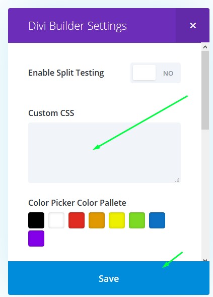
Custom CSS box
Click Save and Update the page.
Cloning the module
Now, let’s clone our blurb to the other two columns.
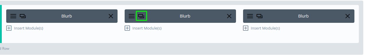
Cloning the module
Click the clone icon twice, and two new modules will pop up, drag and drop them to empty slots.
Edit the content as per your needs. Change the title, content box and the icon.
To change the title that appears on hover, go to module settings and select Advanced tab. See the Before box and find the title text there. Also, to change the blurb module background, change the colour that’s inside the Main Element box, that you can also find in Advanced tab.
That’s it, all done!
Latest Posts
 Divi 5 Update: 110 New Sections Added to Divi Den Pro
 Divi Motion Text brings Typing, Highlight, and Word-swap Animations to Your Headlines
 Divi Mask Library | 4,500+ Custom Image Masks for Divi 5
 Divi 5 Update: 42 New Sections and 4 Pages Added to Divi Den Pro
 Invest Starter Site for Divi 5 (Seven of 20 Coming Soon)